Blog and News
React Form Building: Essential Dos and Don'ts
By Software Engineer Mandy Lloyd
Introduction
React is a JavaScript library developed by Meta for building user interfaces, often single-page applications with a seamless, responsive user experience. It allows developers to create dynamic and interactive web applications using reusable user interface (UI) components. Its component-based architecture breaks down complex interfaces into manageable pieces, enhancing code maintainability and scalability, while also contributing to improving the digital experience for end users. With its seamless integration with modern libraries and tools, React significantly influences the development of modern digital services, making it highly suitable for Bixal's work in building and maintaining federal websites that cater to millions of users. Additionally, the React community offers guidelines for building accessible components, ensuring that digital services are usable by everyone.
When building dynamic and interactive forms using React, it’s important to keep best practices in mind to produce efficient, scalable and maintainable code. From validation to file organization, let’s explore some dos and don'ts when building forms in React.
Best Practice Dos
Implement a Validation Library Early On
Adding validation for each requirement can be a time-consuming and complex task. Instead of reinventing the wheel for validating user-entered data, implement a validation library early in your project. This approach streamlines the validation process and effectively handles diverse form field inputs.
One popular library for this purpose is React Hook Form (https://react-hook-form.com/). Known for its speed and ease of use, this library keeps things simple by using native HTML inputs, which results in fewer re-renders and better overall performance. Additionally, React Hook Form integrates easily with other libraries, like Yup (https://github.com/jquense/yup), for more complex validation needs.
Create a Field Wrapper
Use a field wrapper component to manage common attributes and structures across all fields. By doing this, you can reduce the risk of missing or incorrectly setting attributes, simplify updates, and minimize file changes.
Below is an example illustrating how to wrap fields with a reusable wrapping component. By incorporating styling for error messages into this component, any changes made will be applied to all fields without the need to update field by field, file by file. Passing the attribute data and other field information through props keeps it more organized outside of the return statement.
In a functional component that serves as a wrapper for a form field element, a switch statement can be used to change which type of field is rendered inside.
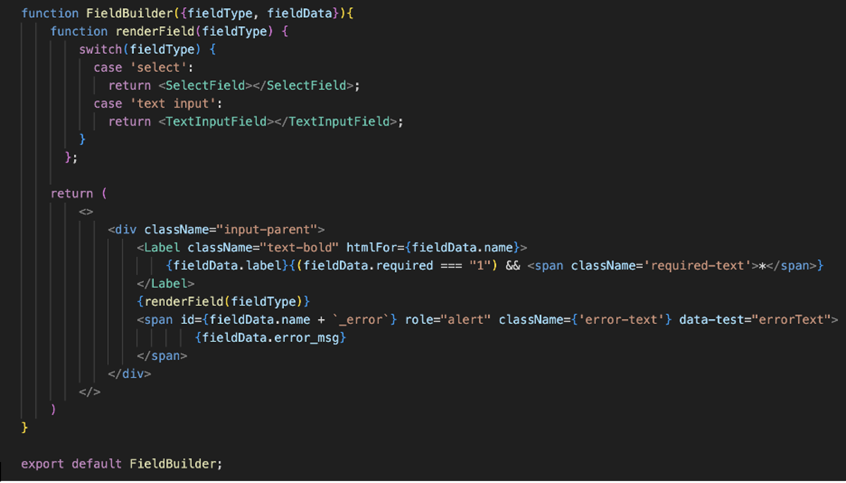
By wrapping a form field in a field component with a prop defining which field type to use and any necessary attribute data, the organization and maintenance of field attribute data can be optimized. In the snippet below, you can see the field type that will be used inside of the wrapper component is defined and passed with a prop called “fieldType.” Then inside “FieldBuilder,” that prop data, combined with a ternary, can conditionally render the correct field component.
Configure Each Field with Required Markup and Functionality
Ensure each field includes essential elements like labels, placeholders, error messages, and any additional error styling. When trying to maintain long form markup files, it can be easy to overlook a missing label or span for one field. In the field wrapper example, there is a structure consisting of a label, field input, and an error message span. By keeping these elements within a single wrapping component file that applies to all field items, you guarantee that those essential components will be available for every field in the form. By proactively setting up the necessary content and functionality, you streamline the development process and ensure consistency throughout the form.
Structure and Organize Files Effectively
Use clear and well-defined file structure, organization, and naming convention to make the code source readable and maintainable. Well organized files will facilitate easier navigation and understanding of the application's natural flow.
Example directory structure:
my-react-app/ ├── public/ │ ├── index.html │ └── ... ├── src/ │ ├── assets/ # Static assets like images, fonts, etc. │ │ └── ... │ ├── components/ # Reusable individual components │ │ ├── Button.js │ │ ├── Input.js │ │ └── ... │ ├── forms/ # Form-related components and sections │ │ ├── MultiStepForm.js │ │ ├── formSections/ │ │ │ ├── AddressSection.js │ │ │ ├── PersonalInfoSection.js │ │ │ └── ... │ │ └── formHelpers/ # Form-specific helper functions │ │ ├── validation.js │ │ └── ... │ ├── helpers/ # General helper functions │ │ ├── jsonHelper.js │ │ └── ... │ ├── pages/ # Full pages │ │ ├── StartPage.js │ │ ├── PathSelection.js │ │ └── ... │ ├── styles/ # CSS/SCSS files │ │ ├── main.css │ │ └── ... │ ├── App.js │ ├── index.js │ └── ... └── ...
Summary of each directory role or contents:
• public/—Contains static files like index.html.
• src/—Main source directory for the application code.
• assets/—Stores static assets like images and fonts.
• components/—Contains reusable individual components such as buttons, inputs, etc.
• forms/—Contains form-related components and sections.
• formSections/—Contains specific sections of forms, like address or personal info sections.
• formHelpers/—Contains helper functions specific to forms, like validation logic.
• helpers/—Contains general helper functions used throughout the application, such as API calls.
• pages/—Contains full-page components that represent different routes.
• styles/—Contains CSS/SCSS files for styling the application.
• App.js—The main application component.
•index.js—The entry point of the application.
Test, Test, and Test Again
Testing is important when building a dynamic form in a React.js app. It's crucial to cover a range of scenarios, including user input, form submission, and handling edge cases. By planning and conducting comprehensive tests, you can ensure that the form functions smoothly, minimizing errors and preventing invalid user inputs. Using a tool such as Jest (https://jestjs.io/docs/tutorial-react) to set up automated component testing is ideal to include continuous testing in your development pipeline.
Additionally, accessibility testing is essential to ensure the form is usable for everyone. This includes activities like verifying keyboard navigation, screen reader compatibility, and responsiveness across different devices. By conducting thorough testing on your form, you can create an inclusive and user-friendly experience for all users.
Don’ts
Avoid Long Files of Form Markup
Refrain from creating lengthy form markup in component files as they can be challenging to navigate and vulnerable to errors. Utilize field components to simplify maintenance and enhance readability. This may include using a component library or creating your own simple and reusable components.
Don't Underestimate the Power of ARIA States and Properties
Leverage Accessible Rich Internet Applications (ARIA) states and properties to enhance form accessibility and functionality. Before resorting to custom functions, explore the potential of ARIA attributes for implementing form features.
A non-comprehensive list of helpful ARIA attributes and what they are used for:
aria-required: Indicates that an input field is required for form submission. It helps screen readers announce to users that the field must be filled out.
aria-invalid: Indicates when the value entered in an input field is invalid. It helps users identify and correct errors in their input.
aria-describedby: References the ID of an element that provides a description or error message for the input field. It allows screen readers to announce additional information about the field.
aria-labelledby: References the ID of an element that serves as the label for the input field. It ensures that screen readers correctly announce the field’s label.
aria-disabled: Indicates when an input field is disabled and cannot be interacted with. It informs users that the field is unavailable for input.
aria-readonly: Indicates when an input field is read-only and cannot be edited. It informs users that the field’s value cannot be changed.
aria-live: Specifies that updates to the input field, such as error messages or suggestions, should be announced immediately to the user by a screen reader.
aria-alert: Informs users of important, time sensitive information that requires immediate attention, such as an error message for a required field or invalid input.
Don't Solely Rely on HTML5 Validation
While HTML5 validation offers basic functionality, it may not address all form validation requirements. Expect to still need a validation library to handle more complex scenarios. HTML5 has limitations in dealing with custom logic, cross-field validation, dynamic validation, localization support, and complex data types that deviate from standard types such as text or email.
Don't Neglect Non-Required Field Validation
Include validation for non-required fields that contain user-input data to ensure data integrity. Even though certain fields are optional for users to complete, it is important to impose limitations on the input. For instance, while providing a middle name in personal information may be optional, if a user decides to input it, restrictions should be enforced to flag inputs with special characters or numbers as invalid.
Avoid Vague Error Messages
Error messages should be clear and avoid vague language that may confuse or frustrate the user. A good error message should be concise, specific, and provide actionable guidance.
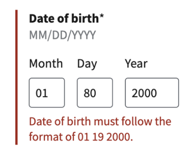
For example, an error message like this can be misleading as the issue is not specified despite the format being technically correct.
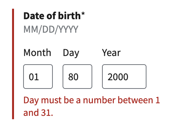
This error message tells the user exactly what needs to be fixed before they can move forward.
Avoid Custom Solutions for One-Off Scenarios
Try to avoid creating custom solutions for isolated scenarios, as they can complicate maintenance and lead to unnecessary technical debt. Instead, focus on building dynamic and scalable solutions that cater to broader requirements. Any additional features or functionality should focus on addressing immediate requirements without prematurely optimizing for edge cases. Don't hesitate to refactor as necessary to ensure scalability in the future.
Conclusion
Building forms in React requires attention to detail and adherence to best practices to deliver an accessible and user-friendly form while also prioritizing code maintainability. By using libraries to improve validation and incorporating ARIA attributes for accessibility, you will enhance both the developer and user experience. Keep these dos and don'ts in mind to fulfill your evolving needs.